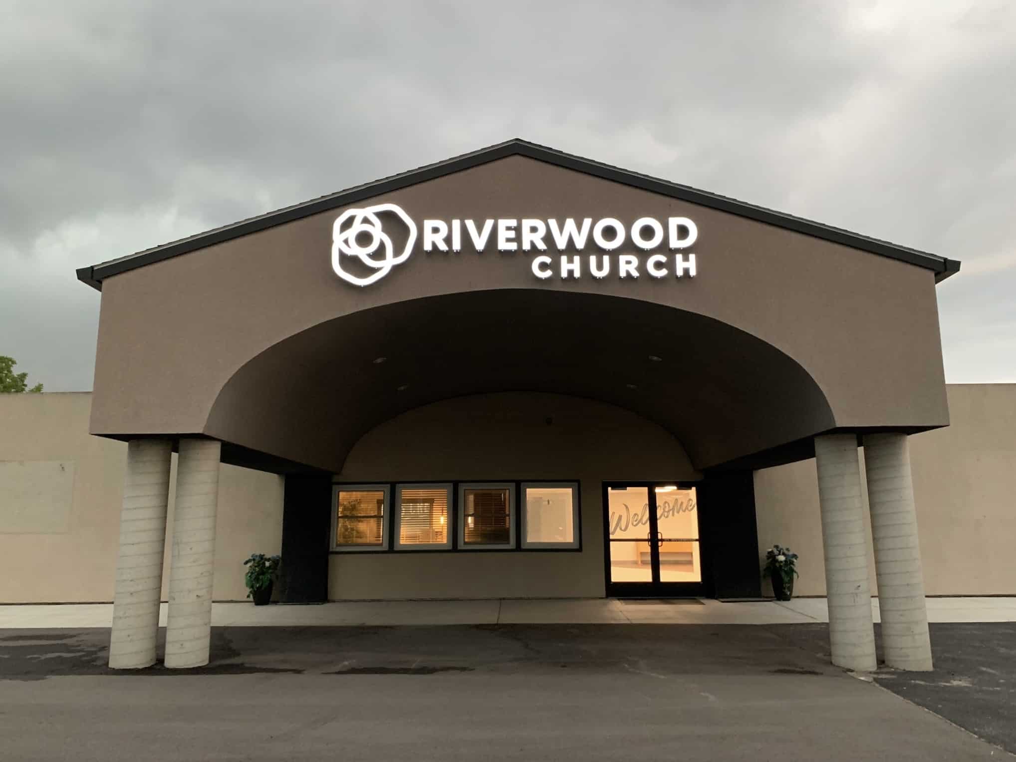
Thanks to the fine work of everyone at Fervor, Riverwood has a logo!
When it came time to develop a logo for this yet-to-launch church, we wanted something unique, yet chock full of meaning. We wanted a "clean" look, but not so perfect as to deny the messiness of life. And we wanted something that could last (we aren't a church that will be chasing every fad). Fervor fully delivered.
So what exactly do those 4 circles in the logo mean?
If you are in need of branding a company, a non-profit, a church, a bank, or even a community, (whether creating the brand, changing it, or improving it), we highly recommend Mike and his entire team at Fervor.

Receive Riverwood's "News & Notes" weekly email in your inbox. Submit your email address below and stay in the loop.
We are on a mission to help people love like Jesus loved and live like Jesus lived.
It doesn't matter to us if you:
No matter where you are in your spiritual journey, we want to help you become who God has created you to be.